2022: A year in art on The Verge
As 2022 comes to a close, the art team at The Verge has looked back on the past year to highlight some of our most memorable and favorite art. Throughout the year, we created a diverse array of original art, including melting ice sculptures, interactive comics, a photo shoot featuring baked goods, art for special issues such as our Homeland series, and many striking images for our reviews.
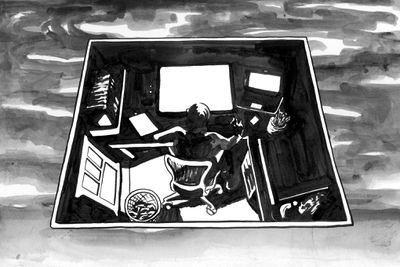
“How to replace the sky” comic
Illustration by Matt Huynh
The Verge’s first interactive comic (of many more to come!) allows users to experience the comic cinematographically. “How to replace the sky” by Matt Huynh is a look at what art-making means in a world where our tools are always changing and, with them, our expectations and ambitions must be recalibrated and assessed. Drawn with traditional media — bamboo brushes dipped in black walnut ink painstakingly made by the artist — the warmth of the human hand comes through every line, even as the project is engaged with from behind the cold glass of a mobile phone or tablet. – Kristen Radtke, associate creative director
Danica Novgorodoff
Danica Novgorodoff
Danica Novgorodoff
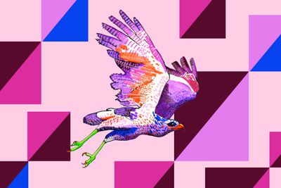
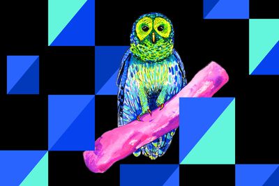
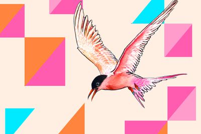
A once-in-a-lifetime bird
Art by Danica Novgorodoff
Birding might be thought of as a traditionally offline activity, but an app that helps bird-watchers track the birds they see also helps scientists monitor the migration patterns of vulnerable species. We wanted to emphasize this physical meets digital world mashup with art that was both: delicate watercolor birds by artist Danica Novgorodoff set against clean digital shapes. The graceful quality of the birds is mimicked with a subtle parallax effect. – Kristen Radtke, associate creative director
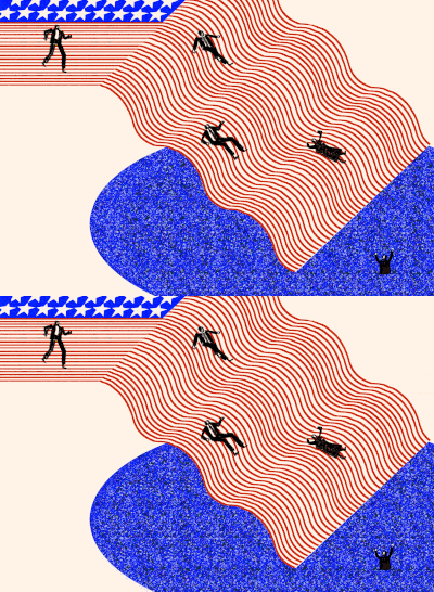

Ash Ponders for The Verge
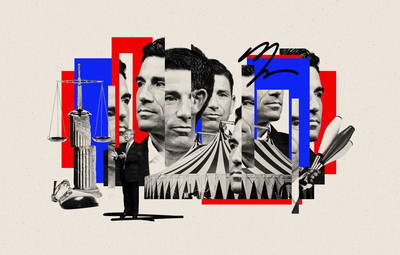
Homeland
One of the most ambitious editorial and design packages The Verge has ever undertaken, Homeland is a series about how government surveillance, bureaucracy, and technology have rewired American lives. Spend some time with the art from each of the stories; I love how varied they are while still working together as a cohesive whole. – Kristen Radtke, associate creative director

Erik Carter for The Verge

Erik Carter for The Verge
What’s wrong with US broadband?
Illustrations by Erik Carter
The Verge and Consumer Reports surveyed readers to see how much Americans are paying for internet access, including equipment fees and overage charges. Russell Brandom analyzed the results and highlighted the poor state of broadband in the country. As a fan of Carter’s work, I thought he was the perfect choice to illustrate this article, which illustrates the absurdity of the ongoing issues with broadband in the US. The headline effectively captures the confusion and frustration surrounding broadband internet in the US. – William Joel, senior creative director
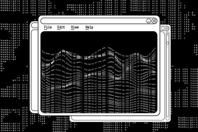
The great fiction of AI
Illustrations by Andreion de Castro
For this feature about bot-assisted writing, we created a design that demonstrates how the technology works: pull quotes and headlines regenerate with the click of a button, mirroring how writers who use the bot software can send their words through algorithms that modify the mood, length, and style of their work. We created a functioning desktop interface within the article, allowing for further interaction and some hidden Easter eggs by our cheeky engineer Graham MacAree. Our biggest challenge was making this “invisible” technology visible, and this approach allowed us to create a design that educated readers while keeping them entertained. – Kristen Radtke, associate creative director

Photography by Joel Goldberg for The Verge
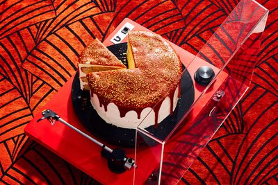
Photography by Joel Goldberg for The Verge

Photography by Joel Goldberg for The Verge
The Verge holiday gift guides
Where do I even begin with this one? Our holiday gift guide shoot was so much fun: we shot 12 distinct holiday dessert scenes, integrating products recommended in the guides. Our major goal was to ensure that the products feel “at home” in their environments so that both the technology and the desserts were presented with equal polish. Gorgeous photos by Joel Goldberg, food styling by Jesse Szewczyk, and prop styling by Maeve Sheridan. – Kristen Radtke, associate creative director
Elon Musk’s giant payday on trial
Illustration by Jason Allen Lee
I laugh every time I look at this animation by Jason Allen Lee: the magazine cutout sheen on Elon Musk’s cheeks; the marionette lines around his mouth, and the vacuum-like speed with which he’s gobbling money while he chatters away. We publish a lot of stories about Musk, and this is probably my favorite approach yet. – Kristen Radtke, associate creative director

Photo by Amelia Holowaty Krales / The Verge
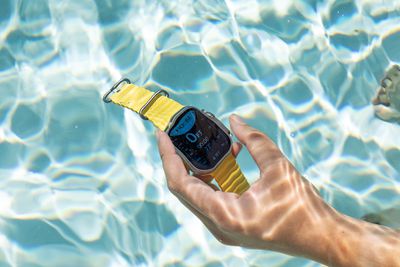
Photo by Amelia Holowaty Krales / The Verge
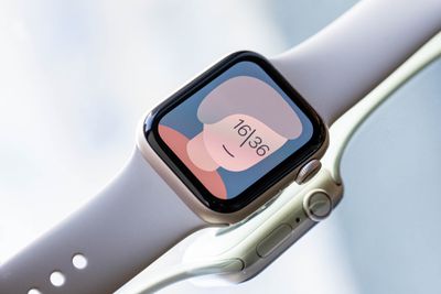
Photo by Amelia Holowaty Krales / The Verge
Apple Watch reviews (Series 8, Ultra, and SE)
When a trio of Apple Watches dropped around the same time, I thought up three distinct shoots for each one based on their main purpose and generally how to make them look cool. The Verge’s queen of wearables, Victoria Song, was up for a pool shoot and general walking around for the Ultra and Series 8 Apple Watches. – Amelia Holowaty Krales, senior photo editor
How Nokia ringtones became the first viral earworms
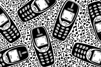
Illustration by Margaret Kimball
The ringtones of early Nokia phones have become ubiquitous nostalgia fare, so for this feature about audio internet archivists, we built a custom-skinned audio player to allow users to listen within a throwback visual scheme and used CSS to animate the illustrated phone screens in their classic neon green. Margaret Kimball’s bold, crisp linework was the perfect accompaniment for the story. – Kristen Radtke, associate creative director
Searching for Susy Thunder
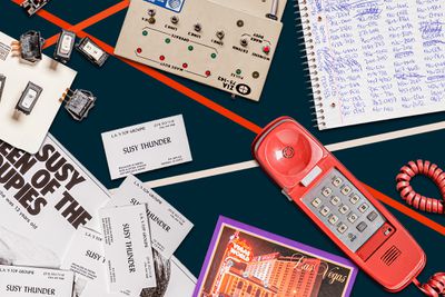
This was one of the first big features that Kristen [Radtke] and I worked on together, and we knew that it would be a collage of sorts. Kristen did a lot of prop styling — we got a lot of random objects online (including vintage platforms from Etsy and a huge box of old matchbooks without any matches in them). We saw these objects as stand-in ephemera from Susy Thunder’s life and had a lot of fun photographing the objects individually in the studio with varying amounts of glitter. Kristen then pieced the images together and creative director William Joel built the post, and the final product was a really fun collaboration. We are still coming across that glitter. – Amelia Holowaty Krales, senior photo editor
Art by The Verge
The many escapes of Justin Sun
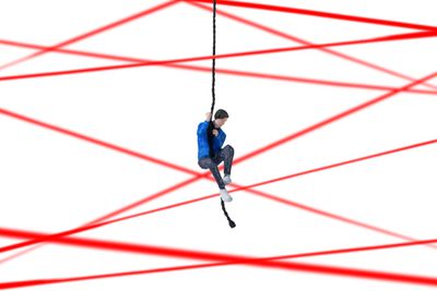
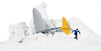
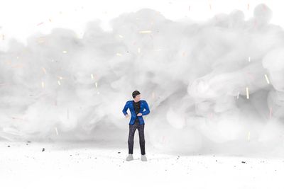
For this story about how crypto grifter Justin Sun continues to evade legal consequences, we created scenes in which Sun was escaping from absurd scenarios: dropping into a bunker, rowing to a deserted island, and traversing a zip line. Illustrator Alex Castro drew 3D renderings of Sun, which we then 3D printed, painted, and staged in-studio (and almost got the fire department called on us when we got overzealous with the smoke machine). –Kristen Radtke, associate creative director
Illustrations by Emily López for The Verge
Illustrations by Emily López for The Verge
The hustler at the end of the world
Illustrations by Emily López
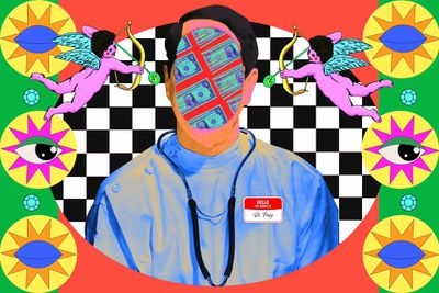
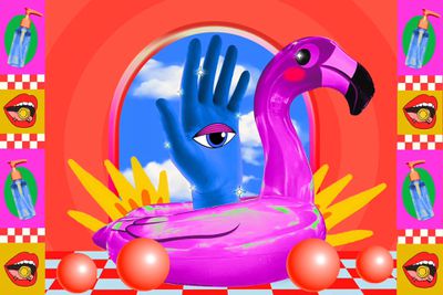
We knew we wanted to create something delightfully unhinged for this feature about a PPE hoarder who tried to infiltrate the black market at the start of the pandemic (and made almost no money in the process). We worked with artist Emily López to create animations that emphasized the absurdity of his quest, while playing with some Florida kitsch. – Kristen Radtke, associate creative director


Doctor-donor fertility fraud
Illustrations by John Ed De Vera
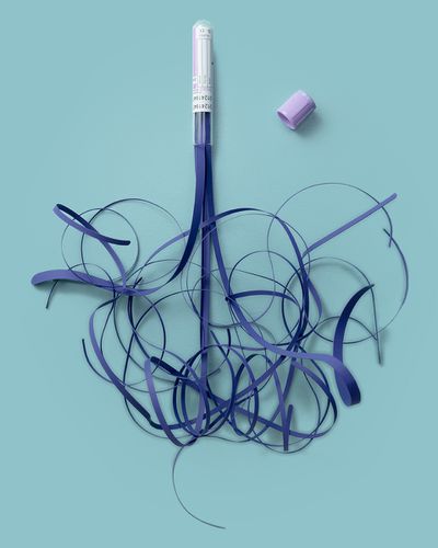
I’ve admired John Ed De Vera’s delicate yet bold paper art for a long time and jumped at the chance to work with him for this story about how a woman discovered her biological father was her mother’s insemination doctor. – Kristen Radtke, associate creative director
Zuck turns up the heat
When our news editor came to the art team about a Meta scoop that Mark Zuckerberg was about to lay off a huge portion of his staff, we had three days before publication. We wanted to elevate the kind of reporting that, due to time constraints, is usually accompanied at similar publications by stock and wire photos. So we worked with Okamoto Studio Custom Ice to create three ice sculptures, which we then melted on camera. The photos, shot by our senior photo editor Amelia Holowaty Krales, reflect the fragility and absurdity of giant tech companies run by volatile personalities (and we shot it in the middle of a record-breaking heatwave). – Kristen Radtke, associate creative director

Illustration by Mengxin Li / The Verge
Mengxin Li / The Verge

Illustration by Mengxin Li / The Verge
The year of the NFT
Illustrations by Mengxin Li
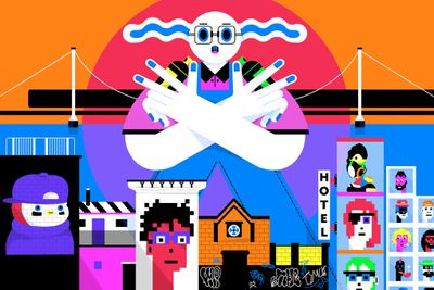
For this package about NFTs, Mengxin Li brilliantly created illustrations that made the nebulous, confusing world of NFTs tangible. At The Verge, we’re often publishing stories about topics for which there is no physical object or space to depict, and Li’s work here is a prime example of visual metaphors working at their finest. – Kristen Radtke, associate creative director
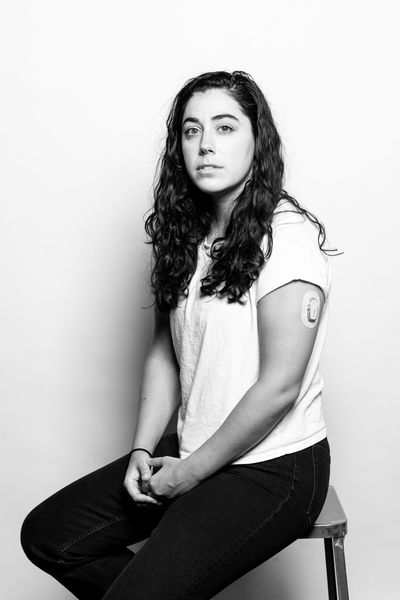
Continuous glucose monitor startups still have to prove their worth
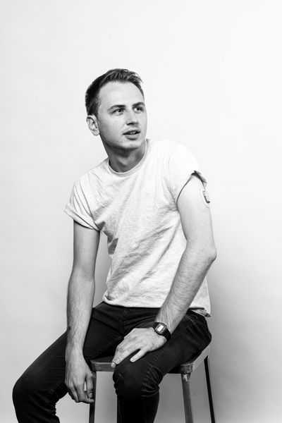
I wanted a simple uncluttered look for the portraits of Nicole [Wetsman] and John that we took in the studio for Nicole’s story about glucose monitors. Using these images in black and white makes the viewer concentrate on faces and details, and I think this enhances the story with their matching poses. – Amelia Holowaty Krales, senior photo editor
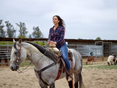
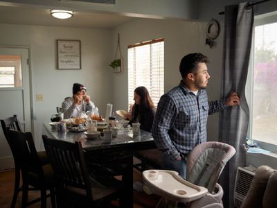
The warehouse next door
Damon Casarez photographed the thoughtful portraits and beautiful landscapes for Justine Calma’s important story about how enormous Amazon warehouses are changing the landscape of a rural community in California. These intimate images coupled with Wes Reel’s bird’s-eye drone footage offered a full view to complement the report. – Amelia Holowaty Krales, senior photo editor
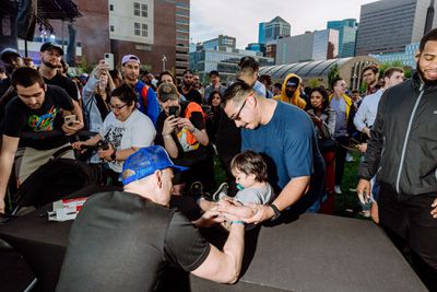
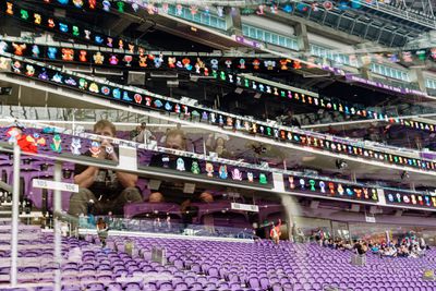
Photo by Simone Lueck for The Verge
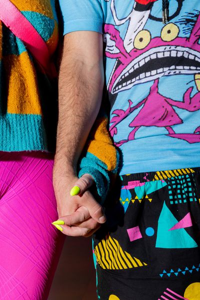
A trip to the GaryVee convention
Photography by Simone Lueck
Simone Lueck followed Mia Sato on her quest to report on VeeCon, GaryVee’s convention where “everyone is part of crypto’s 1 percent.” Lueck’s fun, colorful images perfectly conveyed the energy and personality of the event. – Amelia Holowaty Krales, senior photo editor
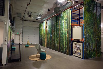
Photo by Meron Menghistab for The Verge
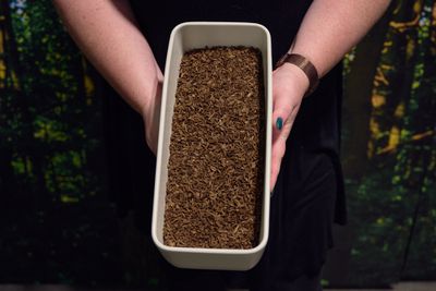
Photo by Meron Menghistab for The Verge

Photo by Meron Menghistab for The Verge
Inside one of the world’s first human composting facilities
Photography by Meron Menghistab, illustrations by Samar Haddad
I have admired photographer Meron Menghistab’s work for a while and was glad when he was able to work on this interesting look at one of the few human composting facilities by Eleanor Cummins. Menghistab’s lovely portraits and interior images worked beautifully with the illustrations and explainer by Samar Haddad, design by Kristen Radtke, and build by Graham MacAree. – Amelia Holowaty Krales, senior photo editor
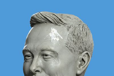
Illustration by William Joel / The Verge
The Twitter deal is all downside risk for Elon Musk
With the sudden proliferation of Elon Musk-related articles, many of which reuse the same Getty images, I wanted to create something somewhat unique to take a break from those images, which we’ve all seen a lot of recently. – William Joel, senior creative director
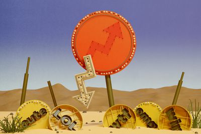
Illustration by Daniel Jurman for The Verge
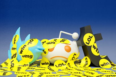
Illustration by Daniel Jurman for The Verge

Illustration by Daniel Jurman for The Verge
The unbearable lightness of BuzzFeed
Illustrations by Daniel Jurman
Daniel Jurman’s work is clever and quirky, which made it a perfect fit for a story about BuzzFeed’s rise and eventual decline. For the lead art, both Jurman and I were drawn to the comparison with the Las Vegas strip. We thought it was fitting because both the strip and the BuzzFeed homepage are characterized by their busy and loud appearance, with flashy buttons and stickers similar to the signs on the strip. Both now feel dated and frozen in time. – William Joel, senior creative director
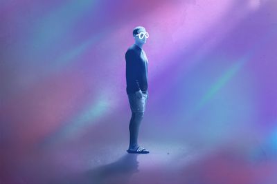
Photo Illustration by Alex Castro / The Verge Photo by Kevin Dietsch / Getty Images
Mark Zuckerberg’s augmented reality
Illustration by Alex Castro
Alex Castro’s illustration of a lonely and sad Zuckerberg attempting to view the world through Meta-shaped lenses perfectly captures the current state of the metaverse. – William Joel, senior creative director
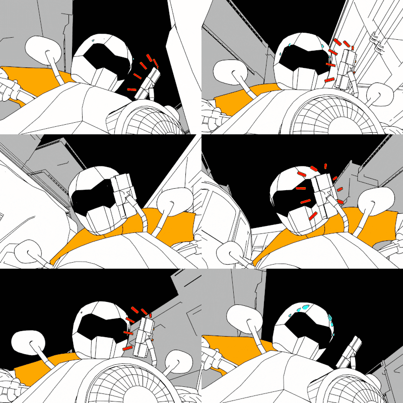
Animation by Alex Castro
The road to instant groceries is paved with broken bones
Illustration by Alex Castro
This looping art from Alex Castro is one of my favorites from this year. Not only is it incredible because it so well conveys the stress these delivery drivers are experiencing but also because it was Castro trying something outside his typical approach. The simplicity and comic-esk style mixed with the weaving down a street quickly while an alert right in the driver’s face evokes the stress one might experience while trying to complete a task in Grand Theft Auto. – William Joel, senior creative director
Musicians are hooking up synthesizers to plants for new sonic possibilities
Illustration by Sean Dong
I’ve been an admirer of Sean Dong’s funny and strange animations for a long time, so I jumped at the chance to work with him on this story about making music from plants. I could watch this one on repeat for days. – Kristen Radtke, associate creative director
How America turned against the First Amendment
Illustrations by Shira Inbar
There is a line right in the first paragraph that says, “Both sides of the political aisle are attacking long-accepted principles of speech law, frequently in ways that are both logically incoherent and deeply concerning.” Based on that, I felt we needed something that felt “internet-y,” busy and loud, but also something that wouldn’t be a strain on a reader’s eyes. Fortunately, Shira Inbar is incredible at all of those and was able to create art that speaks to just how in trouble the First Amendment is but also the absurdity of it all. – William Joel, senior creative director
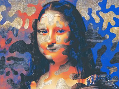
Illustration: Max-o-matic / The Verge
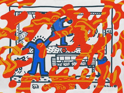
Illustration: Max-o-matic / The Verge
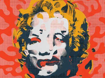
Illustration: Max-o-matic / The Verge
The scary truth about AI copyright is nobody knows what will happen next
Illustrations by Max-o-matic
For this story, I wanted something that felt similar but distinct from AI-generated art. This needed to be more intentional and different enough that it made sense it was saying something about AI-generated imagery. Max’s style felt spot-on for this story that outlines just how messy and complex AI copyright is. The lede does a brilliant job mixing everything together, and the spots are just amazing. – William Joel, senior creative director
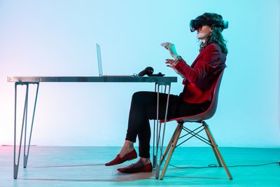
Photo by Amelia Holowaty Krales / The Verge
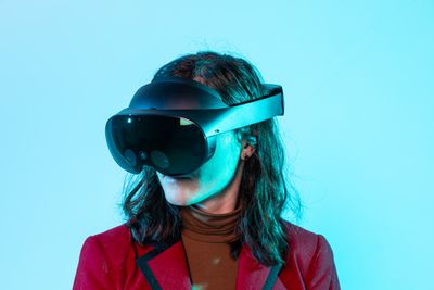
Photo by Amelia Holowaty Krales / The Verge
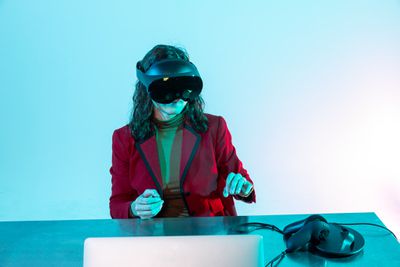
Photo by Amelia Holowaty Krales / The Verge
Meta Quest Pro review: get me out of here
For the review of the Meta Quest Pro, I wanted to create an eerie, sparse scene about working at a computer since one of the ideas of the device is that you can use it to do work in and take meetings. I used three different lights with gels, and this metal hairpin table happened to be in the studio and worked perfectly with the minimalist setting I wanted to create. Adi Robertson’s gestures (she was just scrolling!) were graceful and perfectly completed the image. – Amelia Holowaty Krales, senior photo editor
Read the full article Here

