Steam’s new mobile app looks way, way better
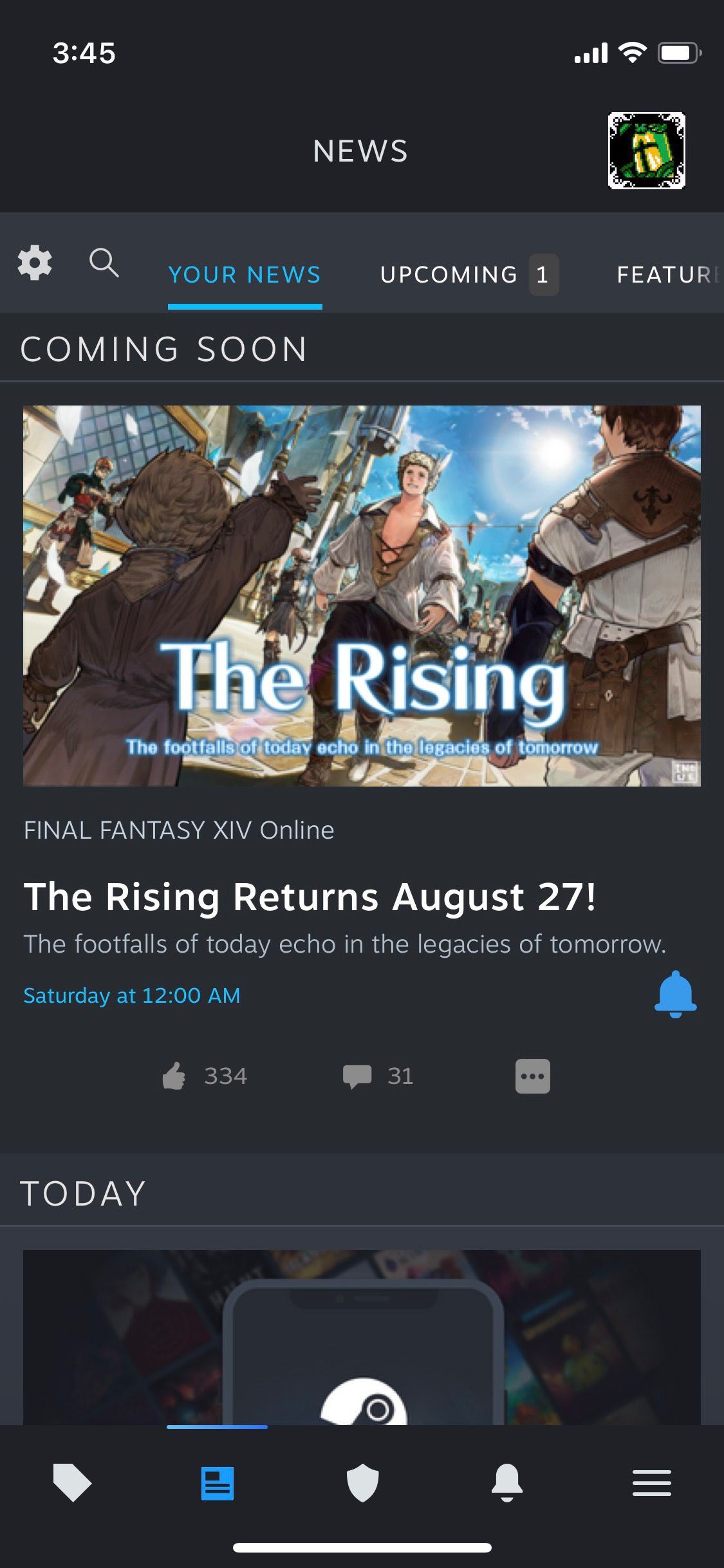
I’ve been using the Steam iOS app quite a bit since getting a Steam Deck, but every time I opened the app, I had to deal with an interface that just felt old — the overall design hadn’t been updated in a very long time. It seems Valve felt that way, too, because it’s now beta testing a new version of the app that looks dramatically different and, if you ask me, dramatically better.
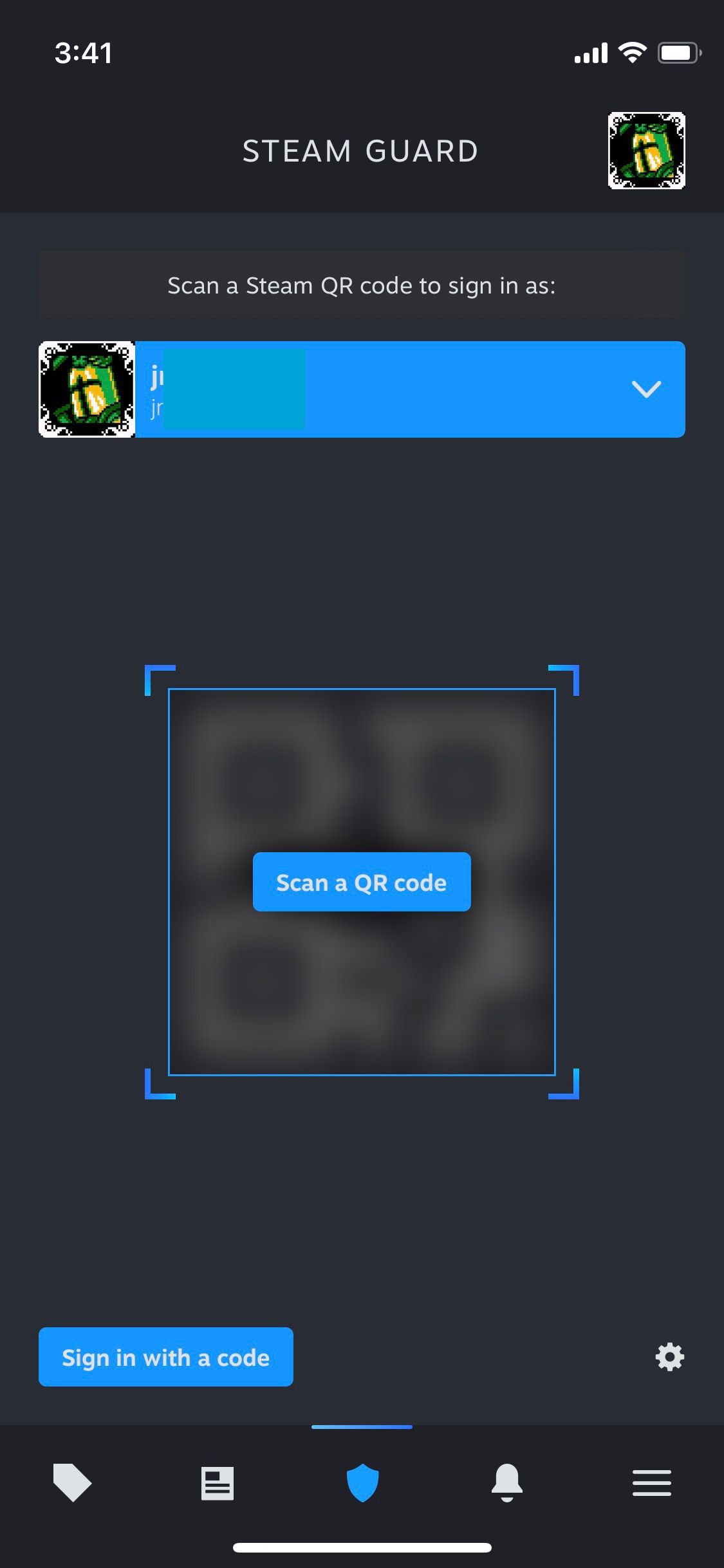
In a blog post, Valve mentioned the new design as one of the key new features of the app, and the improvements, at least in my brief testing on iOS, are immediately obvious. For example, the app now has a navigation bar on the bottom of the screen where you can navigate to things like the store, your news feed, and the Steam Guard section.

But the app doesn’t just have a refreshed coat of paint; it’s built on a “new framework” and has some additional features. My personal favorite? You can now scan a QR code from the Steam Guard section to sign into your Steam account, like what you might be familiar with from Discord’s mobile app. Valve also says the new Steam app has “ smarter notifications, an improved Library, and multi account support,” and you’ll still be able to do things like browse the store and confirm any trades.


Valve is currently beta testing the app on iOS and Android, so it isn’t widely available just yet. If you want to try it the beta, follow the instructions on Valve’s website, though if you’re on iOS, note that there are number of slots available due to Apple’s TestFlight restrictions.
Read the full article Here


