Apple and Samsung smartwatches need more buttons if they want more athletes
Earlier this week, Samsung announced the Galaxy Watch 5 Pro. It’s Samsung’s most durable smartwatch ever and at Unpacked it was clear that the company intends the watch to appeal to outdoor athletes. Apple also revealed at WWDC that watchOS 9 will feature a ton of new running metrics, adding fuel to rumors that a rugged Apple Watch may be on the way. It’s clear that both companies are looking to lure in users from the Garmin and Polar crowd — but aside from battery life and durability, there’s another obstacle that could derail these efforts. Touchscreens.
For better or worse, Apple and Samsung have relied on touchscreen navigation on their smartwatches. That’s fine for casual exercise, or for the average person who isn’t traversing all sorts of terrain with extreme temperatures. It’s not going to cut it for the outdoor enthusiast both companies are aiming at with these “Pro” watches.
I’ve been testing the regular 40mm Galaxy Watch 5, and while it’s not the exact same, the Pro is essentially a bigger, hardier version of the Watch 5. When it comes to UI, they share the same design DNA. That concerns me. On the few runs I’ve gone on with the Watch 5 thus far, it’s been challenging to swipe through screens mid-stride. That’s because it’s August and as the famous Santana song goes, man, it’s a hot one. I’ve got sweaty fingers and sometimes I need to hit pause so that I can rehydrate. To do that, I have to stop and wipe off my hands just so I can swipe right and tap the pause button. Sounds simple enough, but it’s not easy when the humidity is thick enough that it feels like you’re swimming in soup.
I’ve had the same issue when testing watchOS 9 on my Series 7. You have to swipe up or scroll via the digital crown to view all the new running metrics. Many times, I’ve had to stop to successfully swipe through multiple menus just to view one of the new stats. I’d hoped scrolling via the digital crown would be easier, but it’s not.
This isn’t just a summer problem, either. If you’re a triathlete, it’s a swimming problem too. If you work out year-round, it’s an even bigger issue in the winter when you have to wear gloves. I’ve had plenty of “touchscreen-compatible” gloves before, but they’ve never been reliable on my phone let alone on my smaller smartwatch screen.
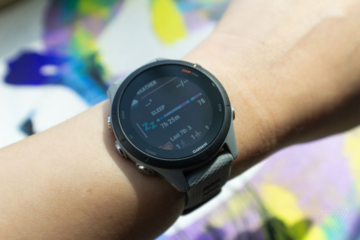
This is a non-issue when you use a Polar or Garmin sports watch. That’s because physical buttons aren’t thwarted by moisture or gloves. Once you get used to them, you can flip through menus without having to look down until you absolutely need to. Some even use a combination of touch and button controls — which is ideal because you can always use the most convenient method for a given situation.

It’s clear that Apple and Samsung are both aware that athletes prize battery life, in-depth metrics, and durability. But it’s less clear if either company has really thought about why so many outdoors enthusiasts and triathletes would rather give up a fancy touchscreen than physical controls.
We still don’t know a ton about Apple’s rugged watch. The details surrounding that have been kept under fairly tight wraps. But the Galaxy Watch 5 Pro isn’t a secret anymore. It’s out in the world, and regardless of what it does have, it’s lacking the physical controls so many triathletes have grown accustomed to. Given that, it’s somewhat perplexing that Samsung eschewed the rotating bezel for the Pro. (That may have been a tradeoff to ensure greater durability.) I have to run more tests, and of course, there are several reasons why you might opt for a more advanced flagship smartwatch over a dedicated multisport GPS watch. But these days, whenever I try to swipe on the Watch 5 or Series 7 with my sweaty digits, I often wish I’d worn my Garmin instead.
Read the full article Here


