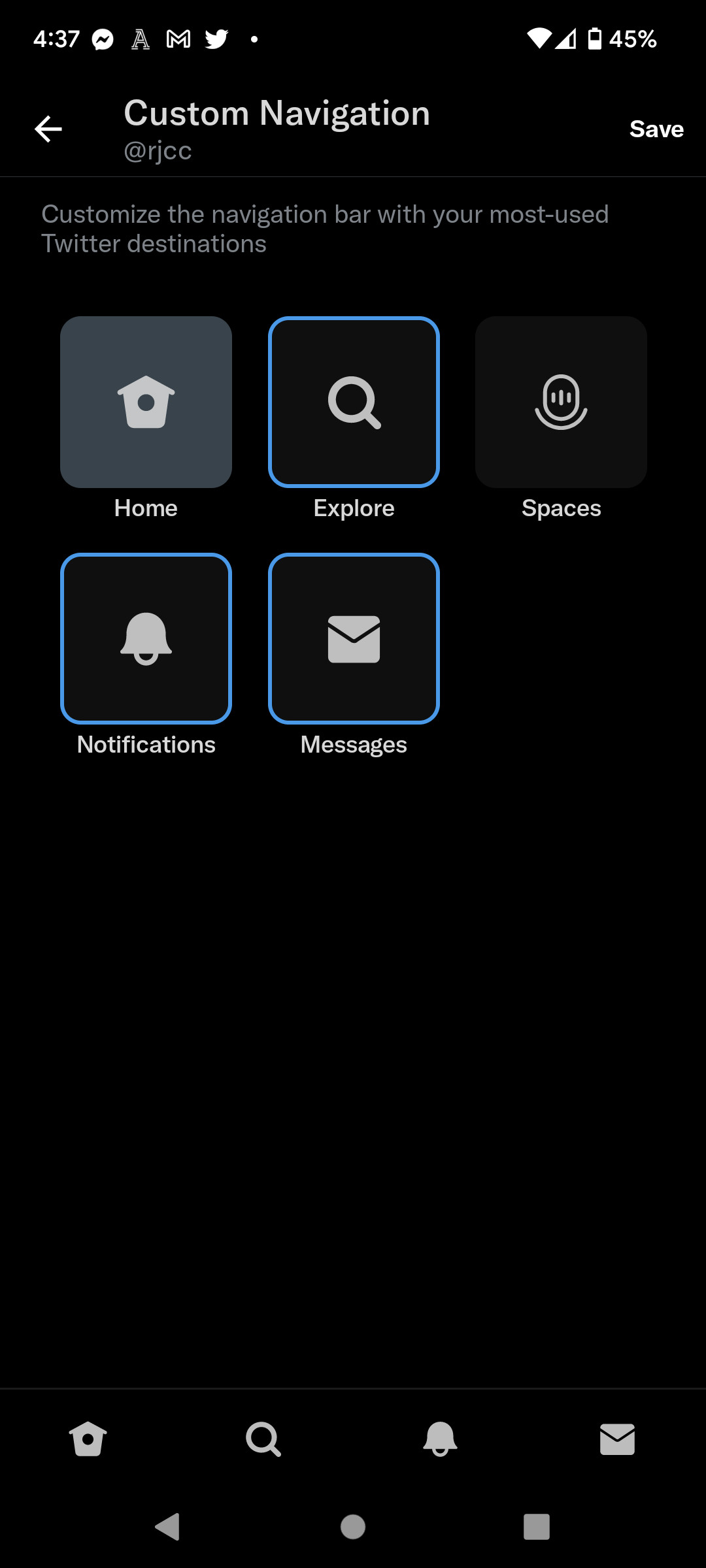
Now Android users on Twitter can pay to drop the Spaces button too
Twitter Blue has finally started letting subscribers on Android customize the app’s navigation bar. The feature, which was previously available only on iOS, lets you get rid of the Spaces icon that’s smack-dab in the middle of your navigation bar (and of course, remove some of the other tabs if you want, too).
With custom navigation, you can reduce the number of displayed tabs to as few as two, or keep all five that appear by default — handy if you’re tired of stretching your finger over the Spaces tab just to get to your DMs and notifications. Twitter first started testing the Spaces tab on iOS last year and rolled out the tab on Android in May, which seemed to only give more inconvenienced users a reason to sign up for the $2.99 / month Blue subscription launched last year.

But Blue can’t save us from every feature that’s cluttering up the app. Twitter announced last week that it’s going to start including more information in the banner that shows active Spaces at the very top of your timeline. While there still isn’t a setting to turn this banner off entirely (neither for free or Blue subscribers), it will now show who’s hosting the Space, who shares a tweet in the Space, as well as relevant Topics.
Read the full article Here


